import json
from IPython.display import FileLink, FileLinks
# Map affiliations of authors of University of Oxford publications to regions
af2Loc = {
"University of Oxford" : "UK",
"University of Warwick" : "UK",
"University of Idaho" : "North America",
"University of Zurich" : "Europe",
"University of Aberdeen" : "UK",
"University of Sheffield" : "UK",
"University of Bergen" : "Europe",
"University of Tokyo" : "Asia",
"University of Arizona" : "North America",
"University of Connecticut" : "North America",
"University of Queensland" : "Australia/New Zealand",
"University of Southern Denmark" : "Europe",
"University College London" : "UK",
"University of Toronto" : "North America",
"University of Washington" : "North America",
"University of Amsterdam" : "Europe",
"University of Edinburgh" : "UK",
"University of California System" : "North America",
"University of Lincoln" : "UK",
"University of Vermont" : "North America",
"University of Western Australia" : "Australia/New Zealand",
"University of Helsinki" : "Europe",
"University of Bordeaux" : "Europe",
"University of Freiburg" : "Europe",
"University of Liège" : "Europe",
"University of Maryland, College Park" : "North America",
"University of Stirling" : "UK",
"University of Montpellier" : "Europe",
"University of Louisville" : "North America",
"University College Cork" : "Europe",
"University of Auckland" : "Australia/New Zealand",
"University of Exeter" : "UK",
"University of Minnesota" : "North America",
"University of Birmingham" : "UK",
"University of Bristol" : "UK",
"University of Córdoba" : "Europe",
"University of Extremadura" : "Europe",
"University of Lausanne" : "Europe",
"University of Otago" : "Australia/New Zealand",
"University of Paris-Sud" : "Europe",
"University of Cape Town" : "Africa",
"University of Groningen" : "Europe",
"University of Konstanz" : "Europe",
"University of Cambridge" : "UK",
"University of Oslo" : "Europe",
"University of the French West Indies and Guiana" : "Latin America",
"University of California, Davis" : "North America",
"University of Bath" : "Europe",
"University of Montreal" : "North America",
"University of the West of England" : "UK",
"University of Aveiro" : "Europe",
"University of Lisbon" : "Europe",
"University of Leicester" : "UK",
"University of Florida" : "North America",
"University of South Florida" : "North America",
"University of California, Irvine" : "North America",
"University of Gothenburg" : "Europe",
"University of Sussex" : "UK",
"University of Bern" : "Europe",
"University of Manitoba" : "North America",
"University of Southern California" : "North America",
"University of Technology Sydney" : "Australia/New Zealand",
"University of Southampton" : "UK",
"University of KwaZulu-Natal" : "Africa",
"Columbia University": "North America",
"Federal University of Rio Grande do Sul": "Latin America",
"Massey University": "Australia/New Zealand",
"Statens Serum Institut": "Europe",
"Swansea University": "UK",
"United States Department of Agriculture": "North America",
"National Museum of Nature and Science": "Asia",
"Natural History Museum and Institute": "Asia",
"Tohoku University": "Asia",
"Stony Brook University": "North America",
"Harvard University": "North America",
"Max Planck Institute for Demographic Research": "Europe",
"Princeton University": "North America",
"Radboud University Nijmegen": "Europe",
"Smithsonian Environmental Research Center": "North America",
"Stockholm University": "Europe",
"Institute of Vertebrate Paleontology and Paleoanthropology": "Asia",
"Royal Ontario Museum": "North America",
"Smithsonian Institution": "North America",
"Uppsala University": "Europe",
"Bond University": "Australia/New Zealand",
"Aarhus University": "Europe",
"Boston Children's Hospital": "North America",
"Boston University": "North America",
"Children's Hospital": "North America",
"American Museum of Natural History": "North America",
"Swarthmore College": "UK",
"Duquesne University": "North America",
"East China Normal University": "Asia",
"US Forest Service": "North America",
"Centre for Research on Ecology and Forestry Applications": "Europe",
"Swedish University of Agricultural Sciences": "Europe",
"Technical University Munich": "Europe",
"Institute of Cancer Research": "UK",
"Federal University of Lavraxs": "Latin America",
"Lancaster University": "UK",
"State University of Campinas": "Latin America",
"Council for Scientific and Industrial Research": "Africa",
"Florida International University": "North America",
"French National Institute for Agricultural Research": "Europe",
"German Center for Integrative Biodiversity Research": "Europe",
"Kyoto University": "Asia",
"Royal Holloway University of London": "UK",
"Smithsonian Tropical Research Institute": "North America",
"Wageningen University & Research": "Europe",
"Zoological Society of London": "UK",
"Emory University": "North America",
"McGill University": "North America",
"McGill University Health Centre": "North America",
"New York University": "North America",
"New York University School of Medicine": "North America",
"National Museum": "Unknown",
"Nederlands Instituut voor Ecologie": "Europe",
"Macquarie University": "Australia/New Zealand",
"Australian National University": "Australia/New Zealand",
"Bielefeld University": "Europe",
"British Antarctic Survey": "UK",
"Centre d'Ecologie Fonctionnelle et Evolutive": "Europe",
"Eötvös Loránd University": "Europe",
"Institute of Avian Research": "Europe",
"UNSW Australia": "Australia/New Zealand",
"Stellenbosch University": "Africa",
"Laboratoire de Neurosciences Cognitives": "Europe",
"Yale University": "North America",
"Chinese Academy of Sciences": "Asia",
"Department of Earth Sciences": "UK",
"Imperial College London": "UK",
"Aalto University": "Europe",
"Institute of Theoretical Physics": "Unknown",
"Mahidol University": "Asia",
"Royal Institute of Technology": "UK",
"Vanderbilt University": "Europe",
"Wellcome Trust": "UK",
"Max Planck Institute for Ornithology": "Europe",
"Santa Fe Institute": "North America",
"Lund University": "Europe",
"Cardiff University": "UK",
"Manchester Metropolitan University": "UK",
"Griffith University": "Australia/New Zealand",
"National Museums Scotland": "UK",
"Oregon State University": "North America",
"Rocky Mountain Biological Laboratory": "North America",
"Federal University of Alagoas": "Latin America",
"City, University of London": "UK",
"Commonwealth Scientific and Industrial Research Organisation": "Australia/New Zealand",
"National Autonomous University of Mexico": "Latin America",
"The Open University": "UK",
"Western Sydney University": "Australia/New Zealand",
"Forest Research": "UK",
"European Molecular Biology Laboratory": "Europe",
"Johns Hopkins University": "North America",
"National Institute of Allergy and Infectious Diseases": "North America",
"Rakai Health Sciences Program": "Africa",
"Federal University of Lavras": "Latin America"
}
# Map regions from the above mapping to ids of groups that will be shown in different colours the matrix diagram
loc2Group = {
"Africa": 1,
"Asia": 2,
"Australia/New Zealand": 3,
"Europe": 4,
"North America": 5,
"UK": 6,
"Latin America": 7,
"Unknown": 8
}
# Initialise intermediate data structure to store: (srcAf, trgAf) -> number of shared publications
srcAfTrgAf2Count = {}
# Initialise intermediate data structure to store: af --> Set of connected affs
# Note that the number of connected affs will determine the colour of each affiliation node
af2OtherAfs = {}
organization = data['organization']
organizationName = organization['name']
# Populate srcAfTrgAf2Count
allAffs = set()
for node in organization['works']['nodes']:
affSet = set()
for creator in node['creators']:
for affiliation in creator['affiliation']:
af = affiliation['name']
affSet.add(af)
affs = sorted(list(affSet))
allAffs.update(affs)
for af in affs:
for af1 in affs:
if af1 != af:
if af < af1:
tuple = (af, af1)
else:
tuple = (af1, af)
if af not in af2OtherAfs:
af2OtherAfs[af] = set()
af2OtherAfs[af].add(af1)
if af1 not in af2OtherAfs:
af2OtherAfs[af1] = set()
af2OtherAfs[af1].add(af)
if tuple not in srcAfTrgAf2Count:
srcAfTrgAf2Count[tuple] = 0
else:
srcAfTrgAf2Count[tuple] += 1
# Populate data structures needed for the matrix diagram visualisation
idx = 0
af2idx = {}
nodes, links = [], []
for tuple in srcAfTrgAf2Count:
if srcAfTrgAf2Count[tuple] > 0:
srcAf = tuple[0]
trgAf = tuple[1]
for af in [srcAf, trgAf]:
if af not in af2idx:
af2idx[af] = idx
if af in af2Loc:
loc = af2Loc[af]
else:
loc = 'Unknown'
grp = loc2Group[loc]
nodes.append({"name": af, "group": grp, "index": idx})
idx += 1
links.append({"source": af2idx[srcAf], "target": af2idx[trgAf], "value": srcAfTrgAf2Count[tuple]})
for template_file in ['vega_by_group.json', 'vega_by_index.json']:
with open(template_file,'r') as vega_template:
content = eval(vega_template.read())
for datum in content['data']:
if datum["name"] == "nodes":
datum["values"]["nodes"] = nodes
elif datum["name"] == "edges":
datum["values"]["links"] = links
with open(template_file.replace('.json','.txt'), 'w') as f:
json.dump(content, f)
display(Markdown(" \
In order to display the matrix diagram of [University of Oxford](https://ror.org/052gg0110)'s outputs' author affiliations, \
please do the following: \
<br />- Open [Vega Editor](https://vega.github.io/editor/#/custom/vega) in a separate tab or window; \
<br />- Click on: [vega_by_group.txt](vega_by_group.txt) or [vega_by_index.txt](vega_by_index.txt), depending on which matrix you wish to display; \
<br />- Copy the content of the file you selected; \
<br />- Paste it (overwriting the default text) into the left-hand side of the editor, as shown below:\
<br /><img src=\"vega_editor.png\" width=\"615\" height=\"1074\" />\
<br /><br />On the right-hand side you will see the matrix diagram, in which affiliations are values on X and Y axes, and the rectangle \
cells in the matrix indicate that authors from the two respective affiliations shared at least one publication together. \
<br /><br />Each region, from the _affiliation to region_ mapping above, is shown by different colour: \
<br />- **brown** cell colour indicates that the corresponding affiliations are **not in the same geographic region**; \
<br />- **any other** cell colour indicates that the corresponding affiliations are **in the same geographic region**. \
<br /><br />The matrix diagram files and the example images of the corresponding matrix diagrams for University of Oxford outputs are shown below: \
"))
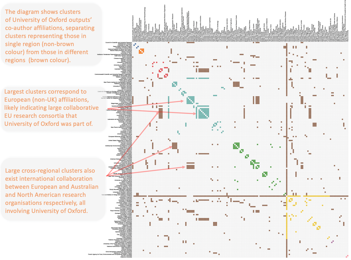
display(Markdown("* [vega_by_group.txt](vega_by_group.txt) - a matrix diagram* in which publications from authors with affiliations in the same region are clustered together:<br>**Click [here](vega_by_group.svg) to see the diagram below in SVG format*<br> <img src=\"vega_by_group.png\" width=\"1300\" height=\"1000\" />"))
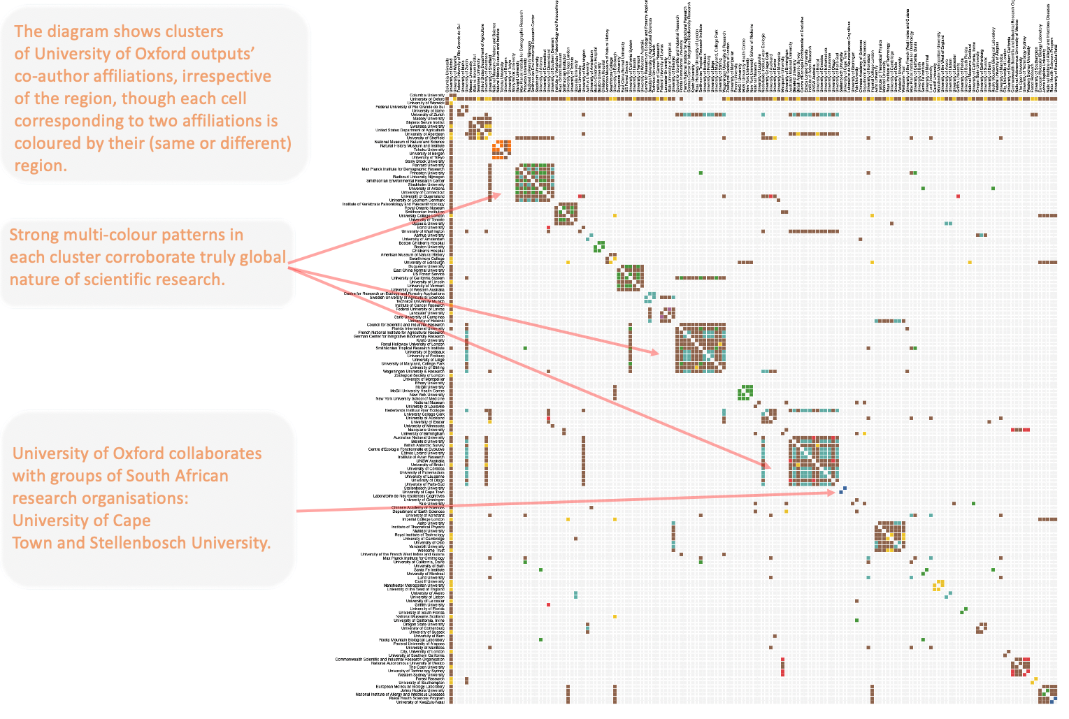
display(Markdown("* [vega_by_index.txt](vega_by_index.txt) - a matrix diagram* in which publications are clustered together irrespective of the author affiliations' regions:<br>**Click [here](vega_by_index.svg) to see the diagram below in SVG format*<br> <img src=\"vega_by_index.png\" width=\"1500\" height=\"1000\" /> "))


